Apartments in the city are shrinking and one of the spaces to face the brunt of this has been the second bedroom or the kid’s room. When it comes to a child’s room, the space must be designed to function as a place he/she can get a restful sleep at night, play and do his/her homework.
So, you’re basically looking at combining three or more spaces into one. With floor space at a premium, you need to be smart with your kid’s room design. So, read on and see if any of our ideas and designs can help you.
Go Vertical
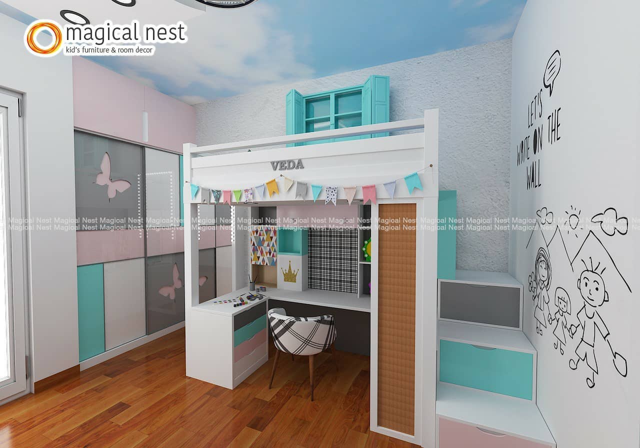
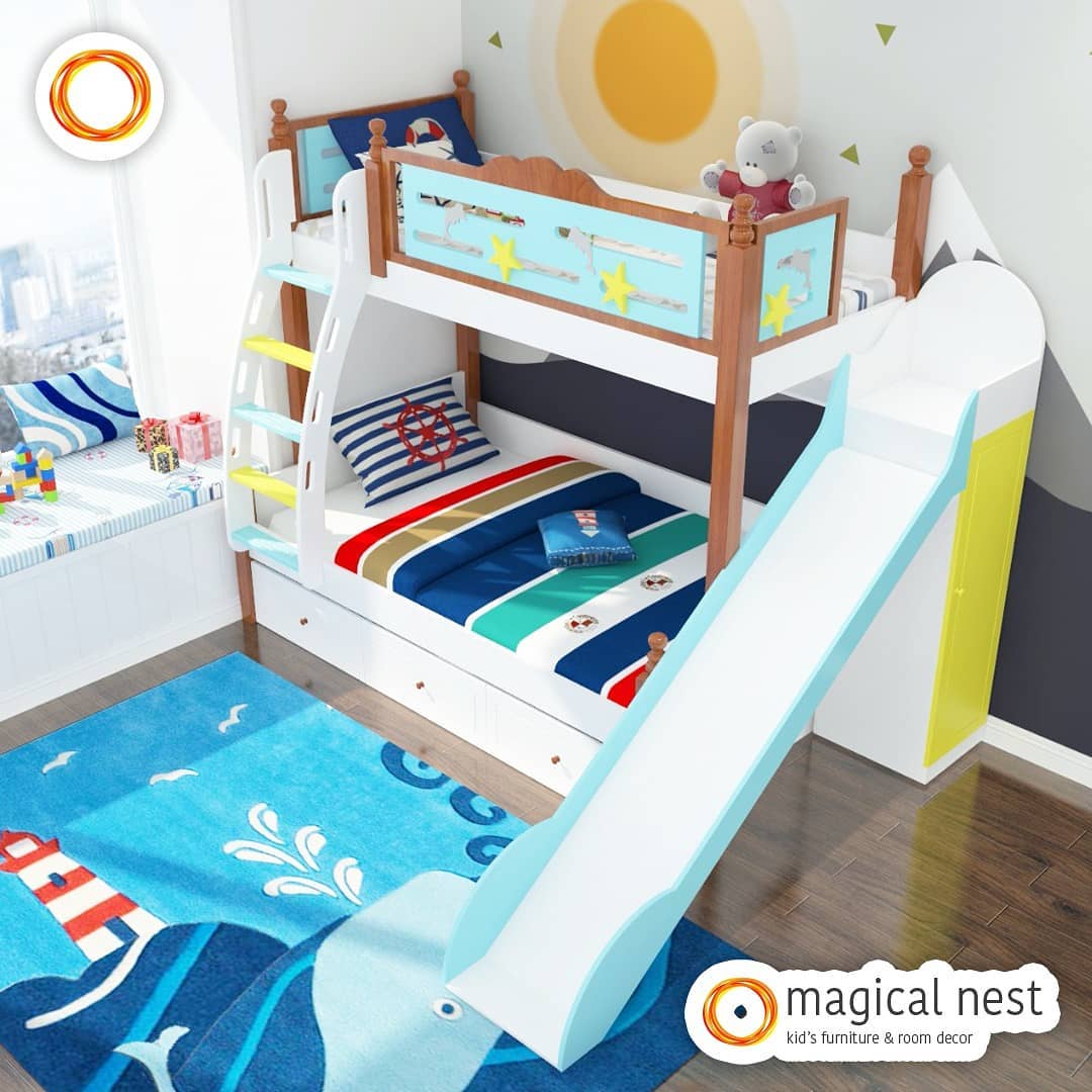
The floor is only one of the 6 planes in a room. When you’re designing a small kid’s room, give the walls the same importance as your floor. Let’s say your child loves reading. Instead of floor-mounted bookcases, look at wall mounted book racks on the space above the child’s desk. If you’ve got two children sharing the room, bunk beds are the perfect solution to your space woes.
The concept can be useful even for a single child. How about placing the bunk bed over the child’s play area? Given that most children love climbing ladders, your little ones won’t make a fuss to go to bed at night too - one design to solve two issues!

Minimize Curves
Curved surfaces take up a lot of space without adding too much functionality. It’s a luxurious look but not really suited to small spaces. For example, take the table your child will use to draw and colour. Pick a square or rectangular table that can be set against the wall or in a corner. If the tabletop can fold down, you’ll get even more space in the room.
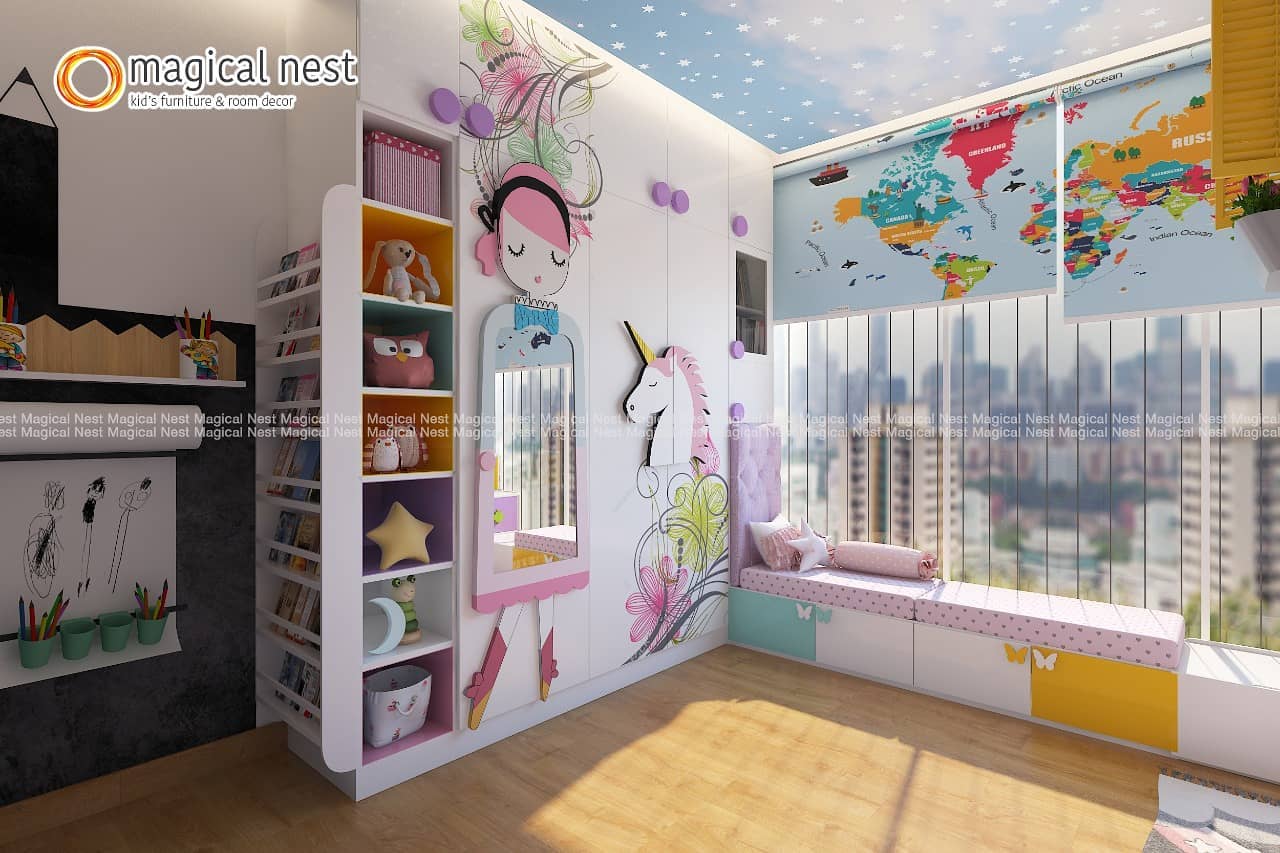
Sometimes switching from a curved silhouette to a straight-lined one may not make a difference in the functional space available but it can change the way the room looks. For example, rectangular mirrors are better suited to small spaces than oval or circular ones.

Say Yes To Blinds
During the day, a child’s room must be well lit with as much natural light as possible. But, at night, the room should be dark and cozy so your kid can sleep well. Thus, all windows and doors must be shaded. Instead of traditional curtains, choose blinds for a small kid’s room.
Whether you choose roller blinds or vertical blinds, they will take up less actual and visual space. Just as you have layered curtains, you may also choose to layer blinds – Have a sheer blind for privacy during the day and blackout blinds at night.

Designate A Place For Everything
Small spaces must be kept tidy to look good. Telling your child to put away his/ her things is only part of the solution. You must designate a place for everything so it doesn’t simply get pushed into a corner. Toys, books, games, etc. all need a place of their own. For example, if your child likes racket sports, the racket needs a designated hook.

Shutter All Storage
Open shelving is rarely a good idea when it comes to furniture for kids. Getting kids to put their toys away is a challenge for every mother and when this is combined with open storage, the look is almost always cluttered and messy. Clutter can make a small room look even more cramped.
So, design storage as closed units with opaque shutters. Toys for small children can be kept in baskets that roll under the bunk bed or inside your kid’s cupboard after playtime. Similarly, when you’re picking out a writing table for kids, look for designs where the top can be flipped up to hide your child’s stationery collection.

Choose Furniture That Does Double Duty
Furniture for kids should not just look good but be versatile too. Let’s look at the beds for kids. While your child sleeps on a mattress above the bed, the space below can be used for storage.
So, look for beds that have built-in storage. Similarly, you’ve probably designed kid’s cupboards with loft storage for winter wear and extra kid’s bed linen. So, how about looking for a chair that can double up as a ladder?
There are very neat designs available today for folding ladder-chairs. As your child grows up, he/she will want to have sleepovers. By picking a sofa-cum-bed for your kid’s room or a trundle bed, you’ll eliminate the stress of worrying about where the other child would sleep.

Find Furniture That Hides
What’s the biggest piece of furniture for kids? The answer is obvious - the bed. Now, what if this kid’s bed could disappear during the day – wouldn’t the room suddenly become so much larger. This magic is referred to as a Murphy bed or wall bed. These kid’s beds are designed to fold upwards until they become parallel to the walls.
Now, instead of taking up precious floor space, the bed will take up wall space. Even this space need not be wasted. You could mount a mirror or frames with motivational quotes on the bottom of the bed that becomes visible when it’s folded up. Similarly, when you’re buying a kids table and chairs, pick designs where the chair can be fit under the table when it’s not in use.
You may also want to consider mats that can be rolled out at playtime and put away for the rest of the day.

Play With Colours And Patterns
Colour and pattern have a big influence on how big or small a room appears. Dark colours tend to make the space look smaller while light colours make it look bigger. Pale yellows, shades of mint green, lavender and light blue are perfect for a kid’s room.
If you were to compare two rooms that had the same floor size but varied heights, the room with the higher ceiling would look bigger. If your ceilings aren’t so high, you can trick the eye into believing that it is by painting the ceiling a lighter shade than the rest of the walls.
Another trick to make a small room appear bigger is to use wide horizontal stripes. Be careful with the proportions of your pattern. Choosing a very intricate pattern with small, repetitive motifs may make the room look cluttered while over-sized large motifs may dominate the space.

Go Angular With Floor Tiles
This is another less-known trick used by designers to make the space look bigger. Instead of installing tiles parallel to the wall, set them diagonally or ‘on point’. Of course, using larger tiles is always better. Like paint, choose light colours for your floor tiles.
However, irrespective of the tile size and colour, setting them this way will give your room a larger look. It’s a visual trick often used by interior designers that may not add functional space but makes the room look less cramped.
Our Two Cents
It isn’t the size of the room that determines whether or not a child will enjoy it but rather how it has been designed. Smart choices in terms of colours and furniture are key to a smart, fun and functional kid's room design. If you find yourself stuck, reach out for professional help – our design experts are always there to help you out.
Get started with your kid's room


6 comments
Mary
Hi I cant buy anything
Khushbu
I want to design my baby boy room with bay window sitting and bed please provide some suggestions
AVNEET CHOUDHARY
Need help to design and implement my kids room.
Ashita Barthur
Want to design my kids room with a bunk bed with storage and study. Please contact me for the same
Dhanalaxmi A
Want to design or buy multipurpose kids room furniture.based in Bangalore.you can contact me at 9481056844
Leave a comment
All comments are moderated before being published.
This site is protected by hCaptcha and the hCaptcha Privacy Policy and Terms of Service apply.